The King of Table
About the Food and Art in Korea
JungFeldt designed the poster and flyer for "The King of Table" - an exhibition and a performance series with artists from Korea, Germany, and Japan, held at the Entretempo Kitchen Gallery in Berlin. The client was Keumwha Art Projects who curated the exhibition.
The identity
The concept of the exhibition was to exchange ideas of Korean food culture and the prominent role food holds in the Korean society; from pleasure to part of rituals, religious ceremonies to an instrument of communication between people to its role in popular culture with TV-shows as Mukbang and Cookbang.
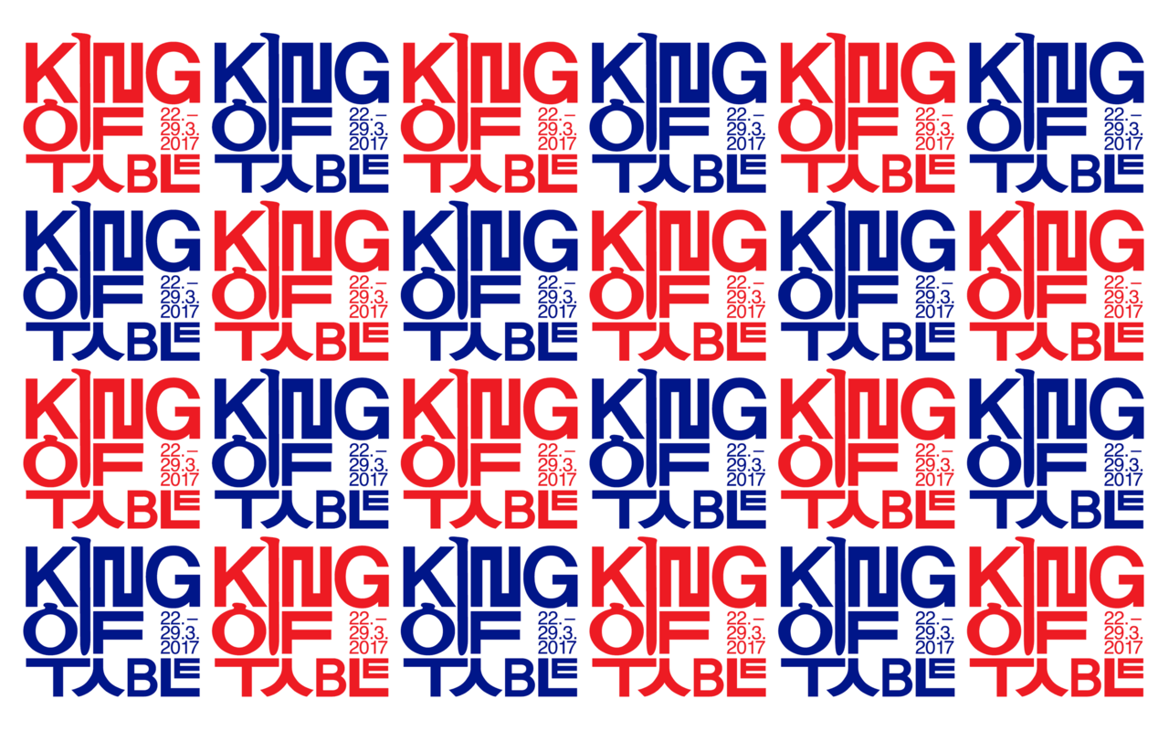
We wanted to visualise the exhibitions focus on Korea for the visual identity, the poster and the flyer. This was done both in the use of colour as well in the typography using Korean fonts combined with Latin letters. We chose a red and blue colour to echo the colours of the Korean national flag. The poster was designed so that it could be used in either blue or red. The idea was also that the red and the blue poster could be used next to each other for a more expressive look. The Korean alphabet and way of writing were used as a source of inspiration for the typography used on the poster. This gave the font a strong presence as well as giving it an immediately Korean feeling to it, also for people who are not familiar with the Korean alphabet. The result was that the font worked perfectly well not only on the poster but also on the photos used for promoting the event on Facebook. The font on top of the colour red and blue on the poster truly gives the poster a Korean feel to it.
We designed the font combining Korean letters with Latin letters in order to make the words readable. Korean fonts have different weights and structure than Latin letters. Our goal was therefore to find a graphical harmony and balance between these two different characters.
Printed material
The exhibition „The King of Table – About the Food and the Art in Korea“ consisted of a performance series and an artist talk. We designed a DIN A1 poster in different colors and a fan fold program brochure for the exhibition.

Front and back of the folded brochure.
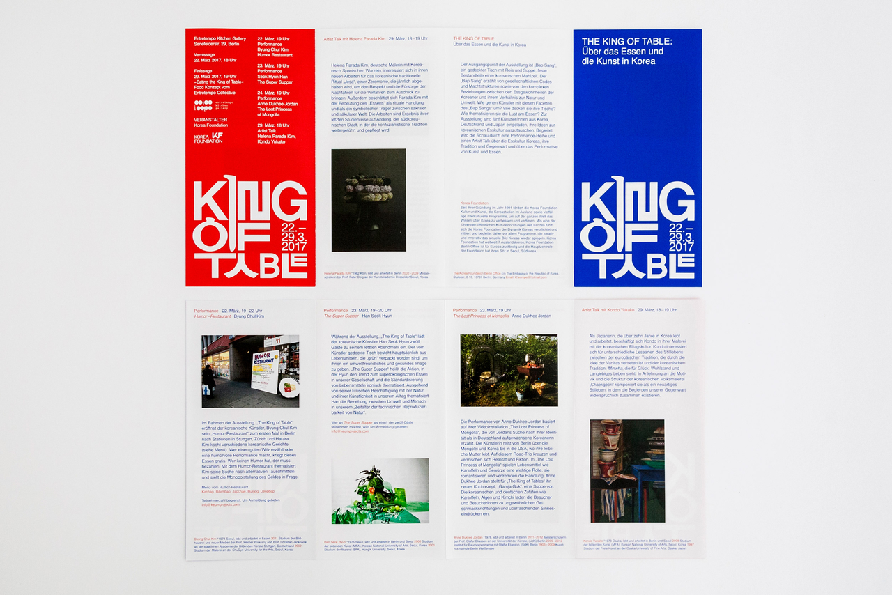
Complete overview of the flyer. A page was dedicated for each of the in total five artists, and includes a photo illustrating their art and work as well as a description of the respective artist's contribution to the exhibition.
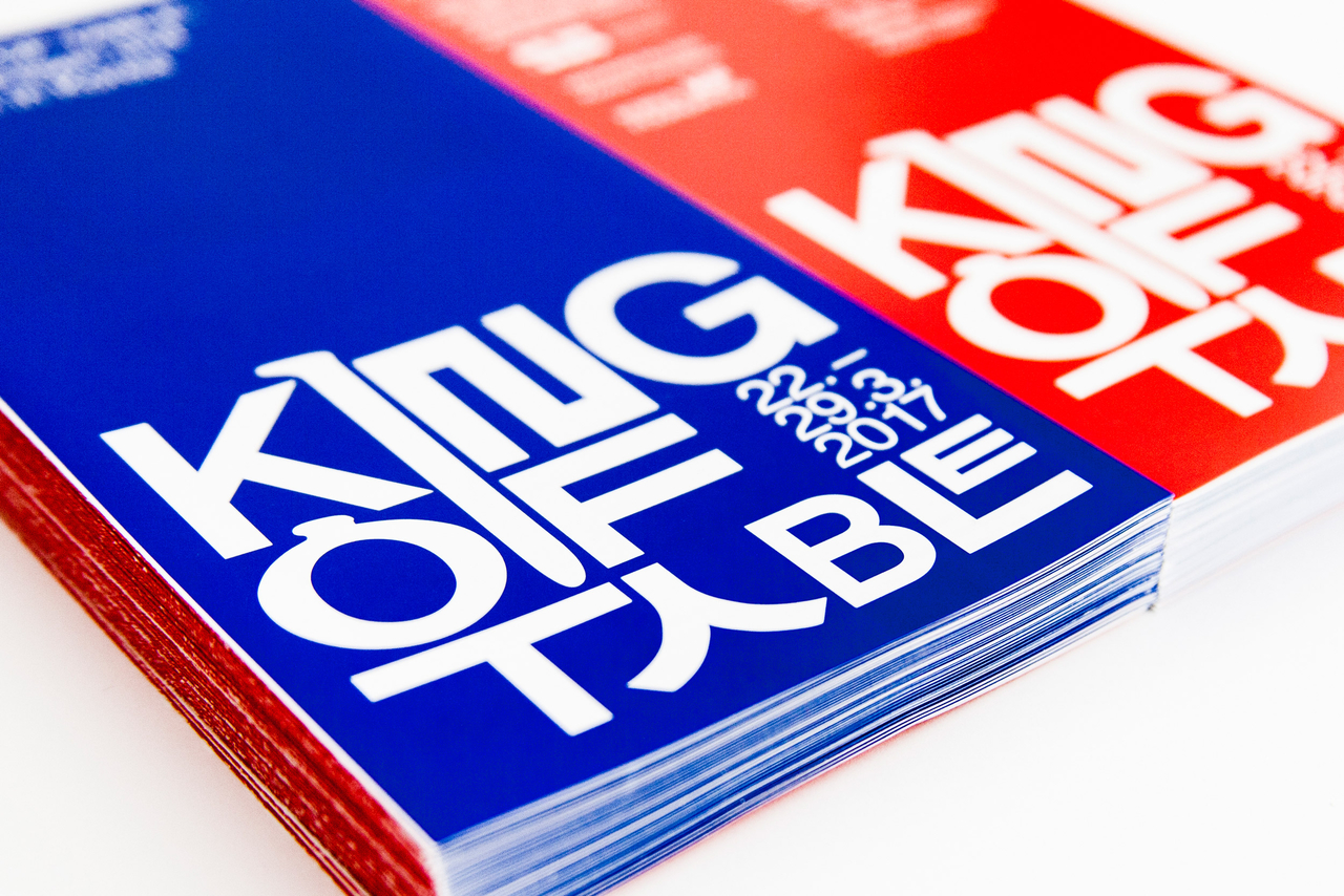
Close-up of the flyer.
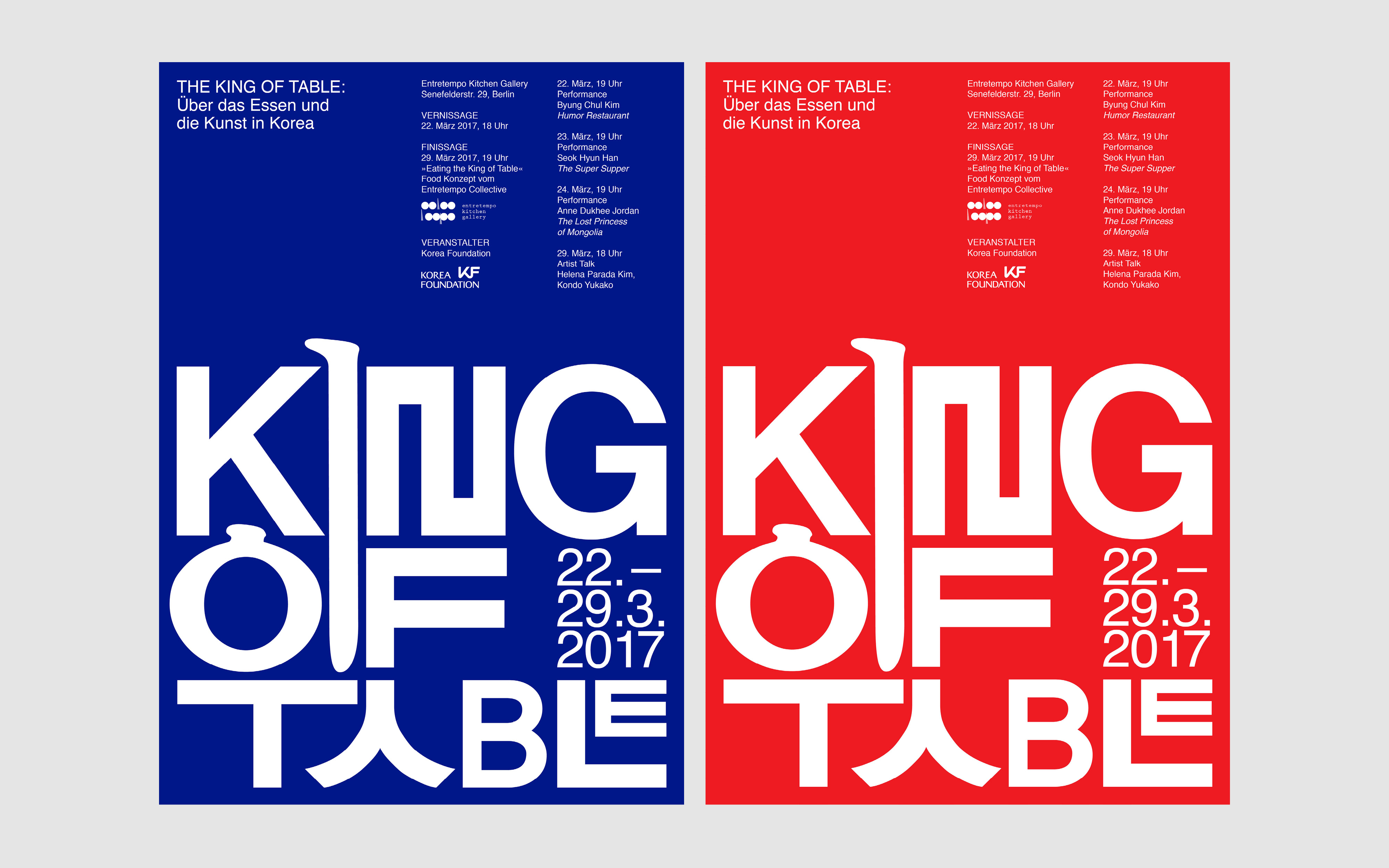
We choose red and blue (Pantone Reflex Blue) for the posters, inspired by the colors of the Korean national flag.
Advertising material for Social Media
The exhibition was mostly advertised in Social Media in the form of different events. The exhibition hosted new artists every day, albeit also a new program every day. We made visual material for each of the different days, with the goal of making it clear for the visitors and participants the changing program and various artists of the exhibition.
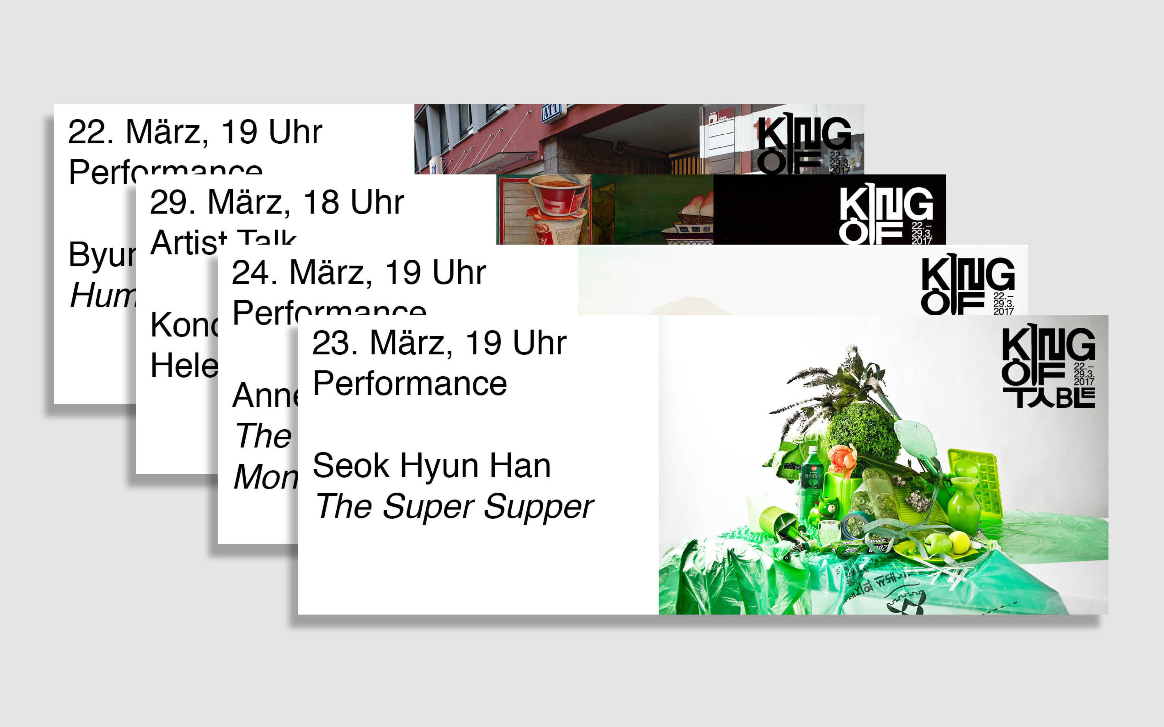
The visual material used for promoting the exhibition on social media.
- Services Delivered
- Graphic Identity
- Print Material
- Social-media material
- Typography